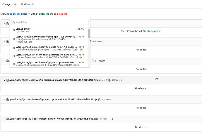
Some issues with the commit view:
It only shows 20 files at once, which is understandable for performance, except for some major UX issues …
- As a user, I want to know if a certain file is present in this commit’s changes.
- As a user, I want to browse to a certain file.
Both of these are majorly hampered.
What is the fastest way to achieve #1? You can step through the pages manually and examine all the filenames. The “Files changed” pop-out menu shows all 20 files of the current page, but that’s a couple clicks that you have to perform every page. Or what I do is slightly faster: Ctrl+F, Enter, Page Down, Next page, repeat.
Ideally, #1 is achieved with a tree view or a filename search that searches all the files (not just the 20 of the present page).
The use case of #2 is to find the file and go to it. This also is hard. Even if you know that a commit does contain a file change, you don’t know which page it’s on. And the Filename Filter can’t help because it only lists files on the current page. So you end up manually execute a binary search on page numbers, paired with Ctrl+F.
Ideally use case #2 is satisfied with a file listing of all files in the commit, preferably a tree view.
I remember at one time GitLab’s commit view showed all files at once, and then this pagination feature was added, which to me was a degradation. I’ve been waiting for it to get better, but it’s been a few years it hasn’t, so I’m wondering if it’s even on the radar, which is why I’m posting.
(We’re currently on GitLab Enterprise Edition 15.1.3-ee)
Are there any existing Issues tracking these UX issues?
